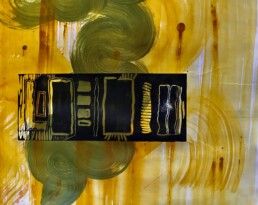
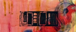
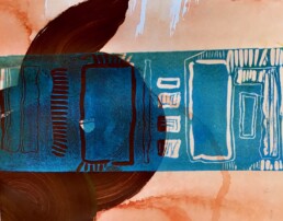
The Mid-C series is a mixed media artwork. When artists use that term, it explains that what the viewer is seeing is a layered approach to reach the completion of the piece. In this case, the imagery that is swirling with bright colors is taken from an acrylic painting that I created and then cut into pieces in a way that readied the next step of the piece. The darker image that lays “on top” of that is a linocut. To combine these two images, I used the painting as the “support” for the inked lino cut and used my etching press to print the lino cut image directly onto the painting.
On the surface, the title of the image is a nod to the American cultural interest of mid-century modern design. The colors are reminiscent of that period of history. Like many of my pieces, the multiple layers of meaning are for me the juice of creating a piece. Mid-C or middle C is also the center C on a piano’s keyboard; the first place perhaps that a child is taught to place its fingers. It interested me to see the parallels in our memories of perceived simpler times


