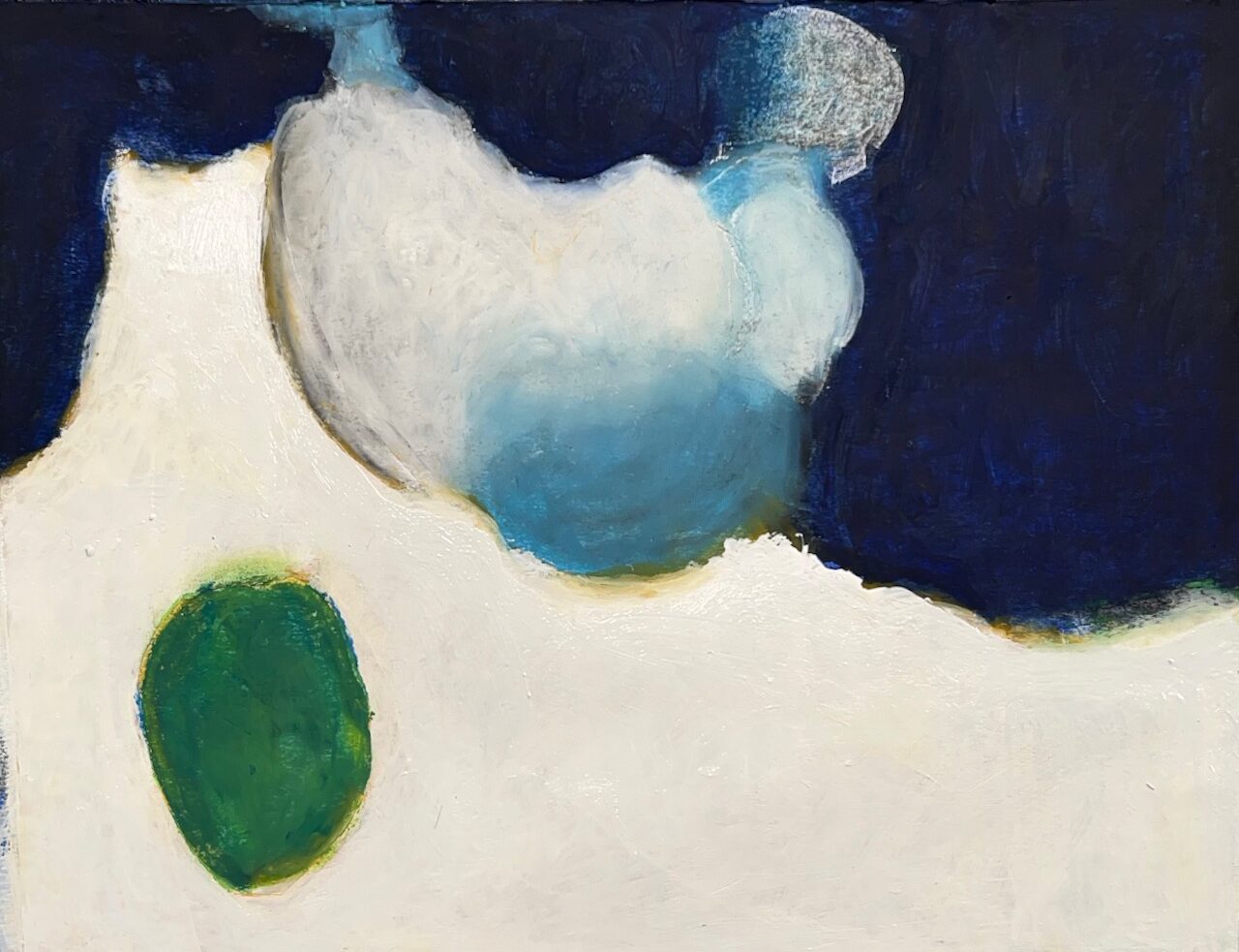
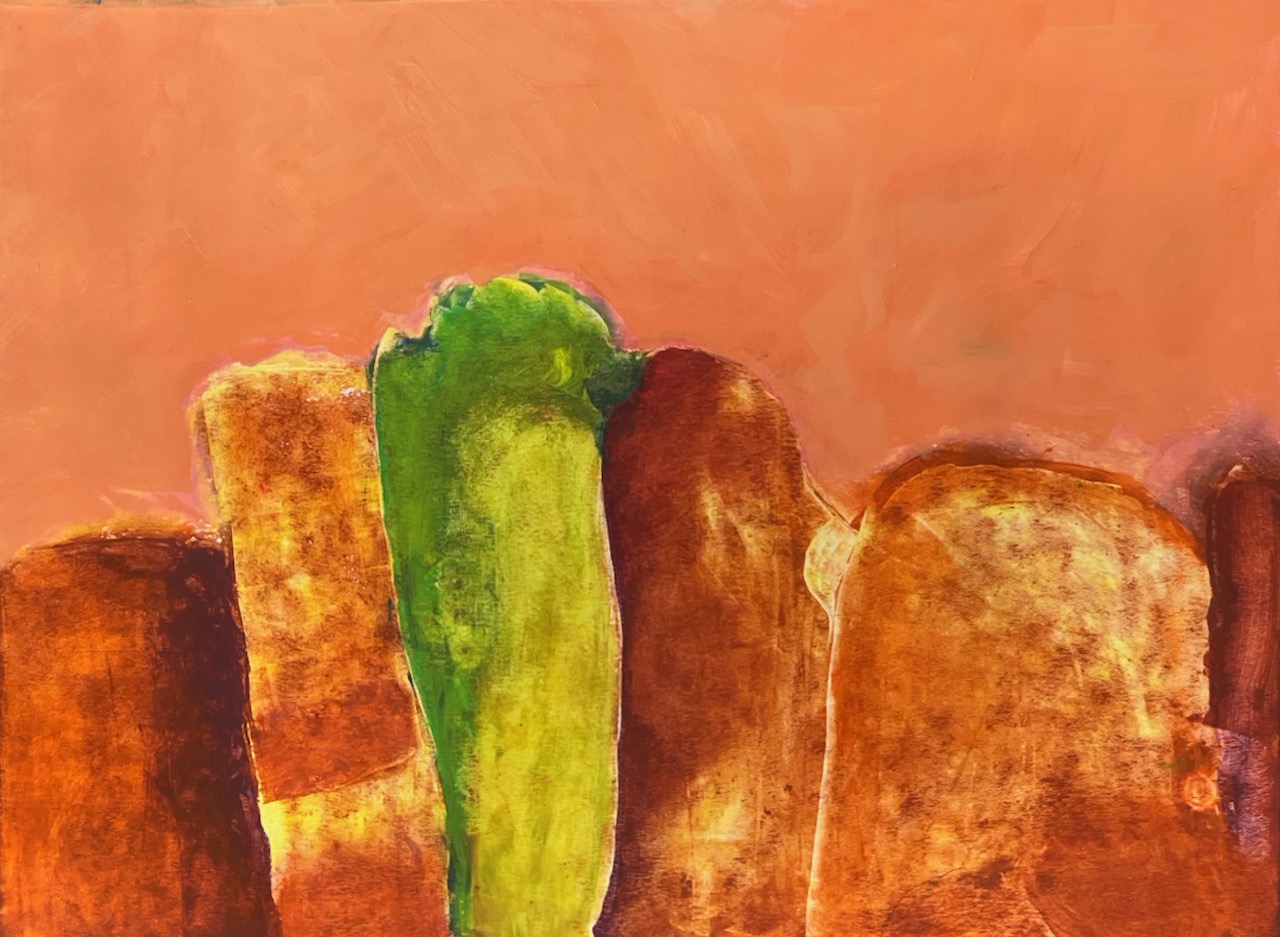
REDUCTIVE
This series is an exploration of what is seen and what is deliberately hidden from view. This reductive form of visual communication invites the viewer to slow down and look more deeply at the little bits of information given. When viewed as a whole, the colors of each painting have a connectedness to one another and yet each painting is different from the others. Through the use of color and form, this series is an invitation to wander through that experience.

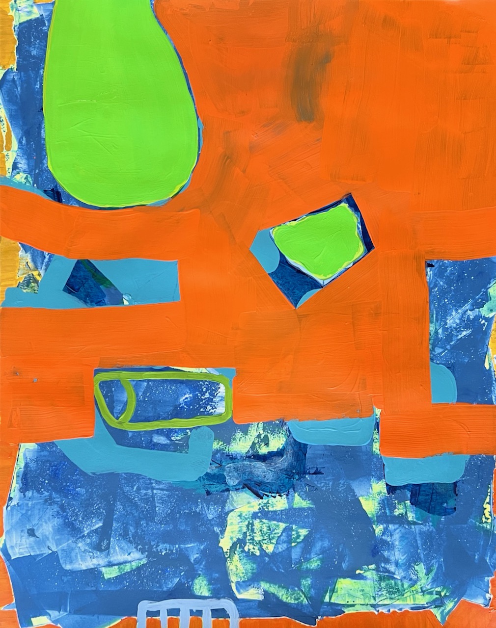

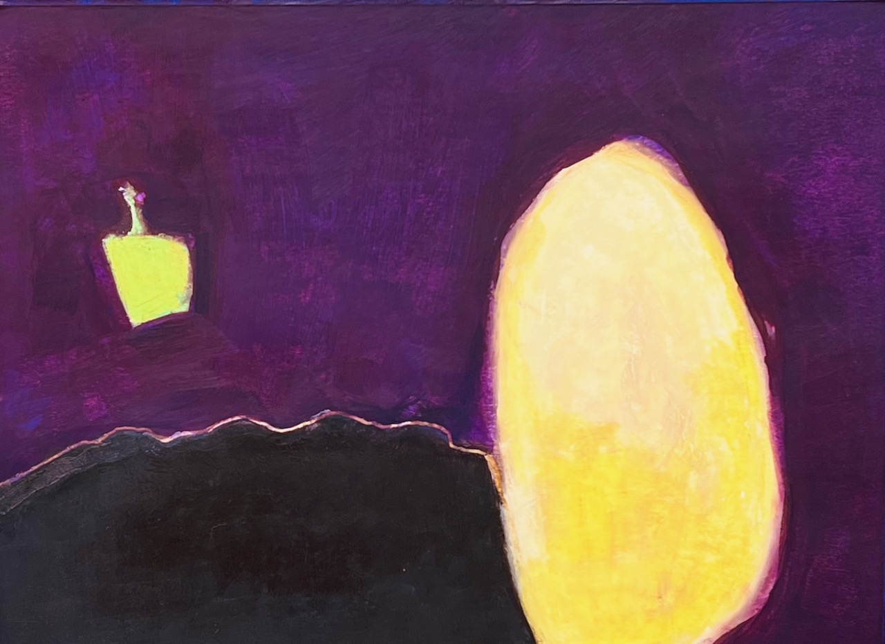
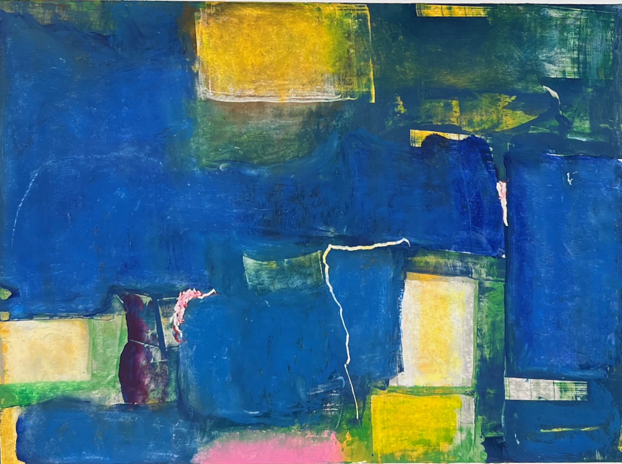
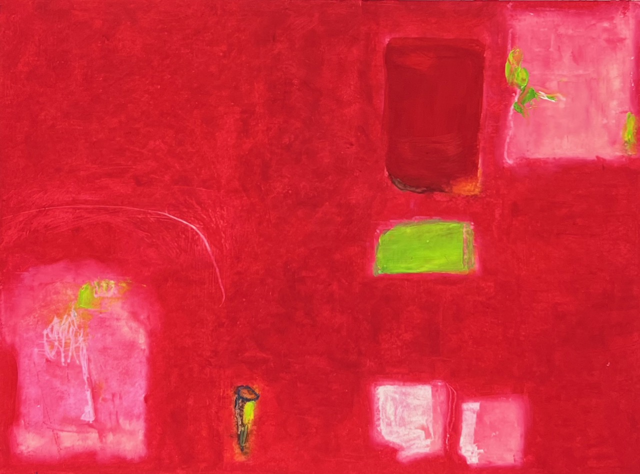
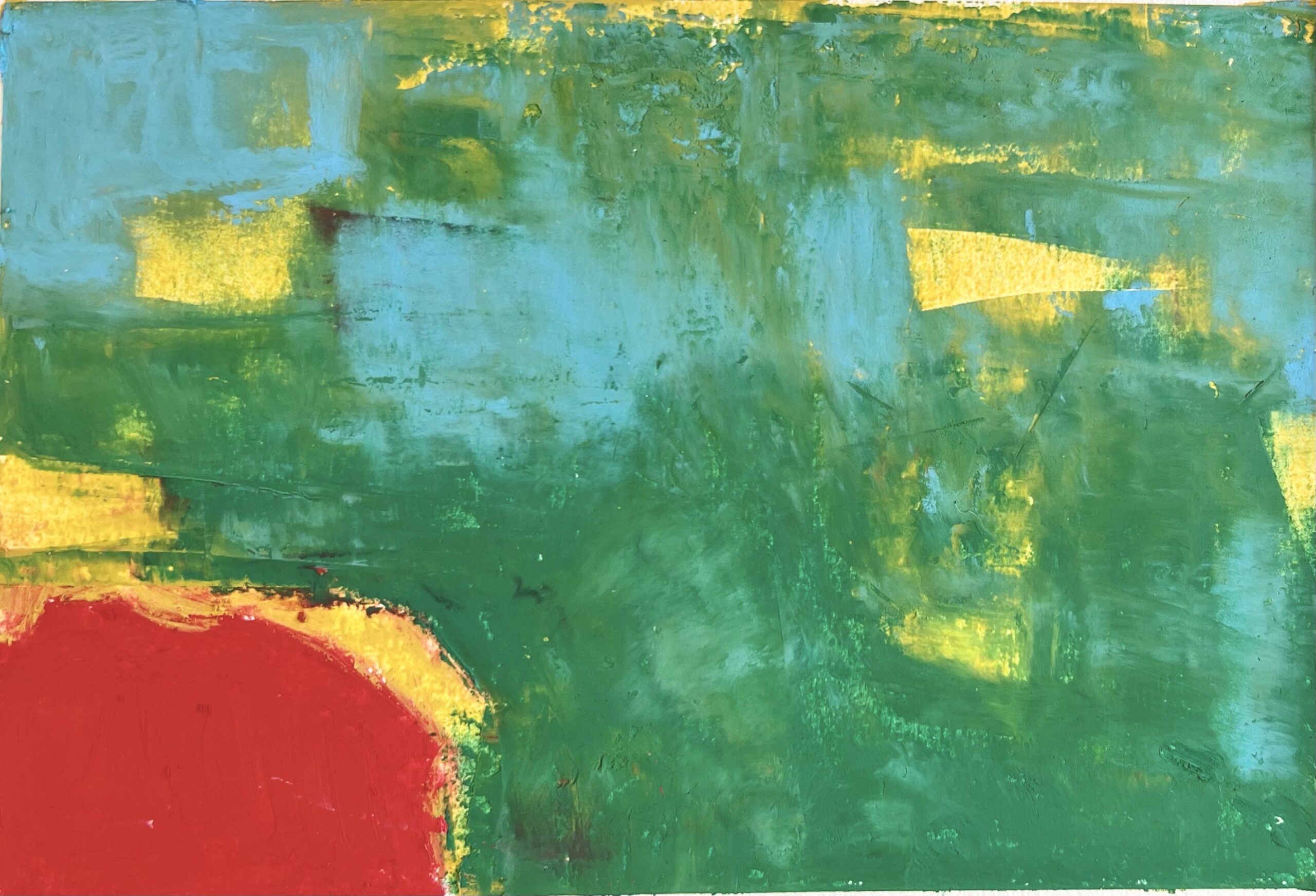
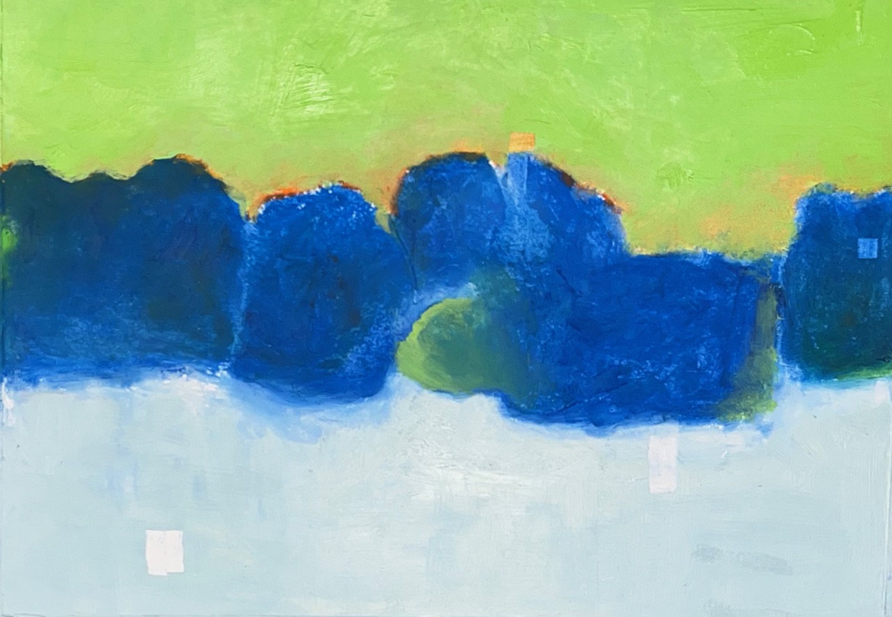
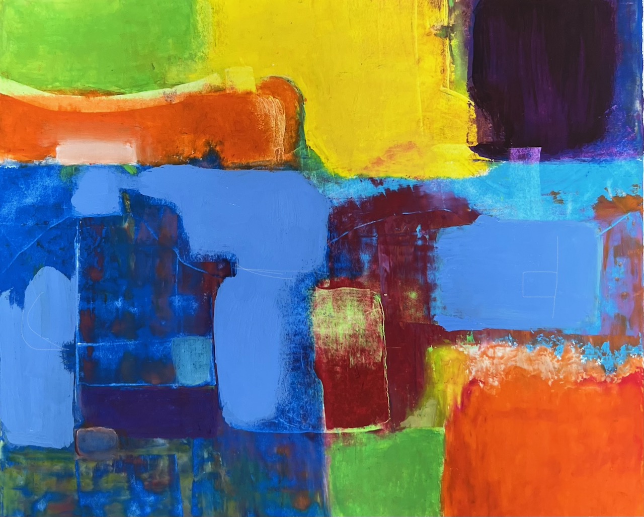
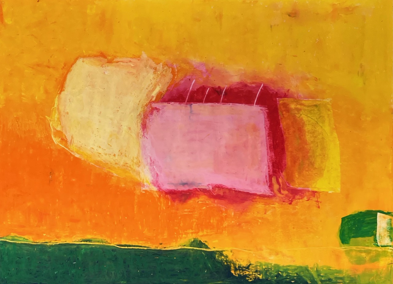
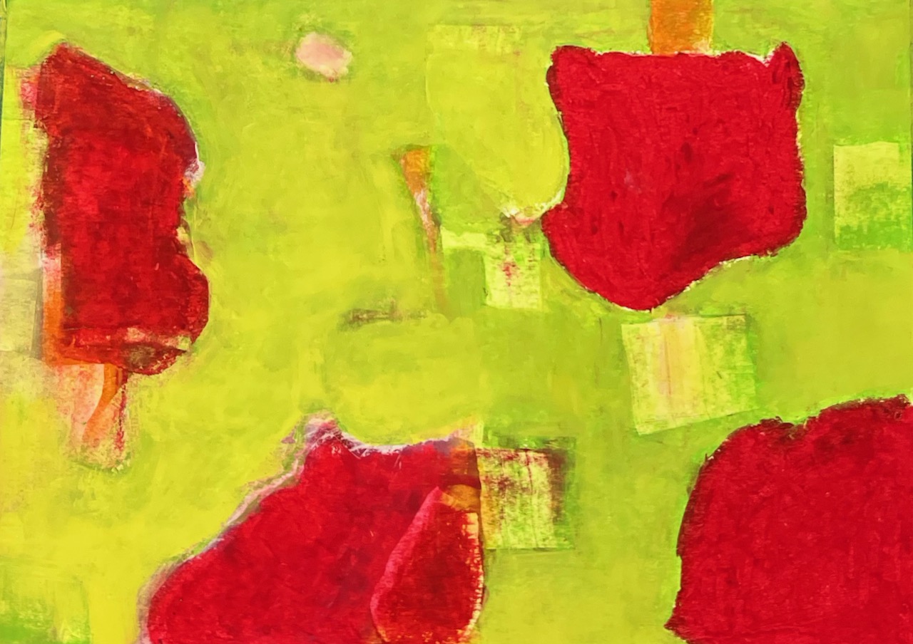
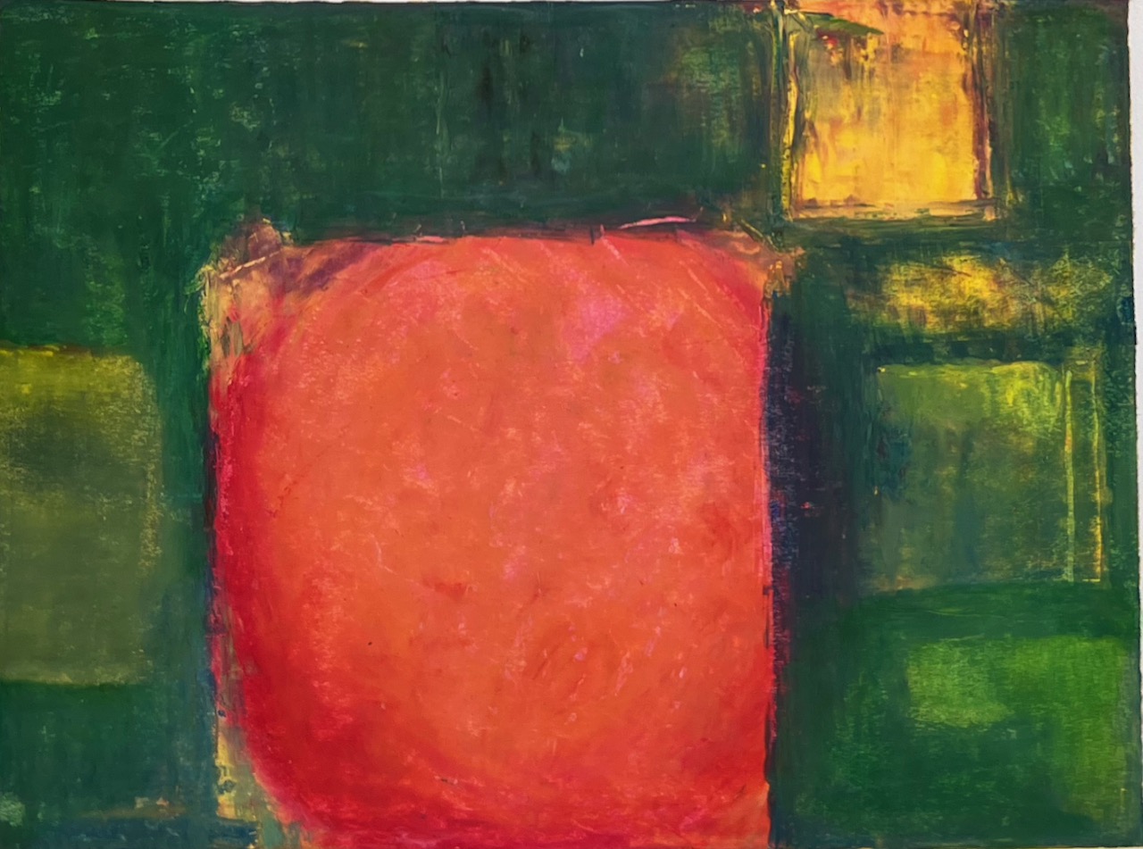
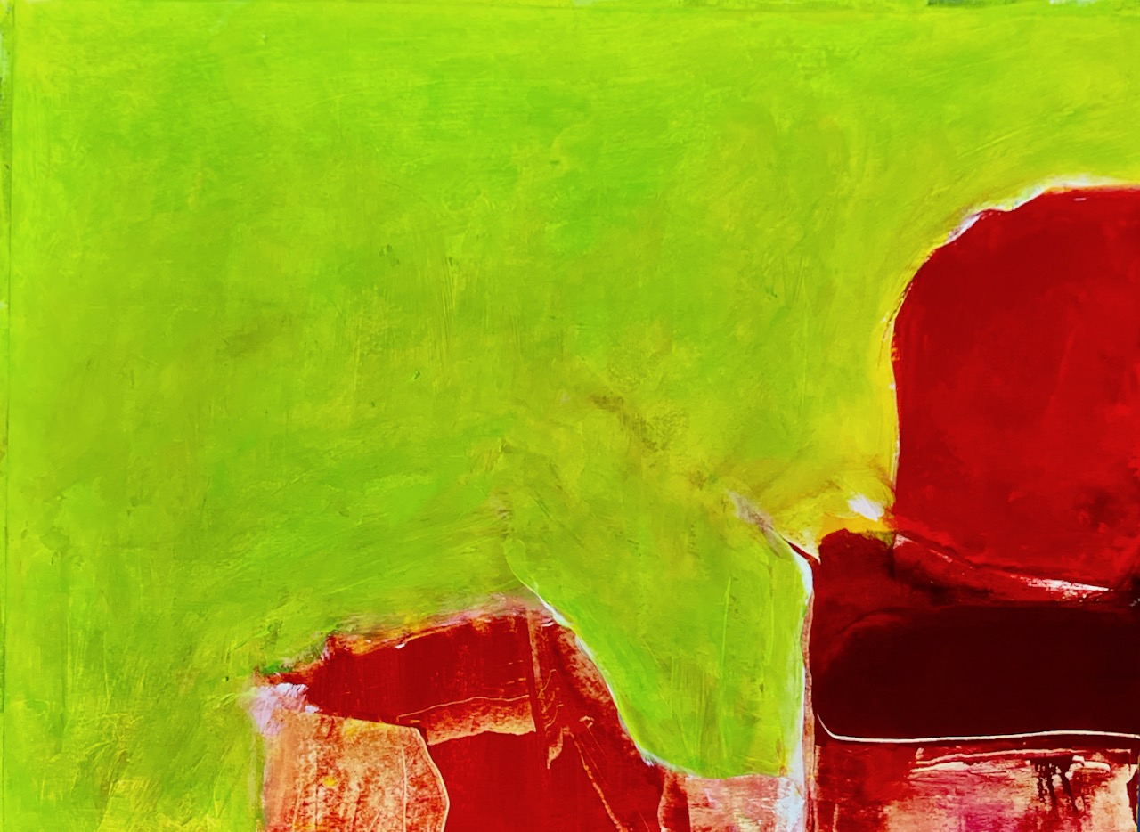
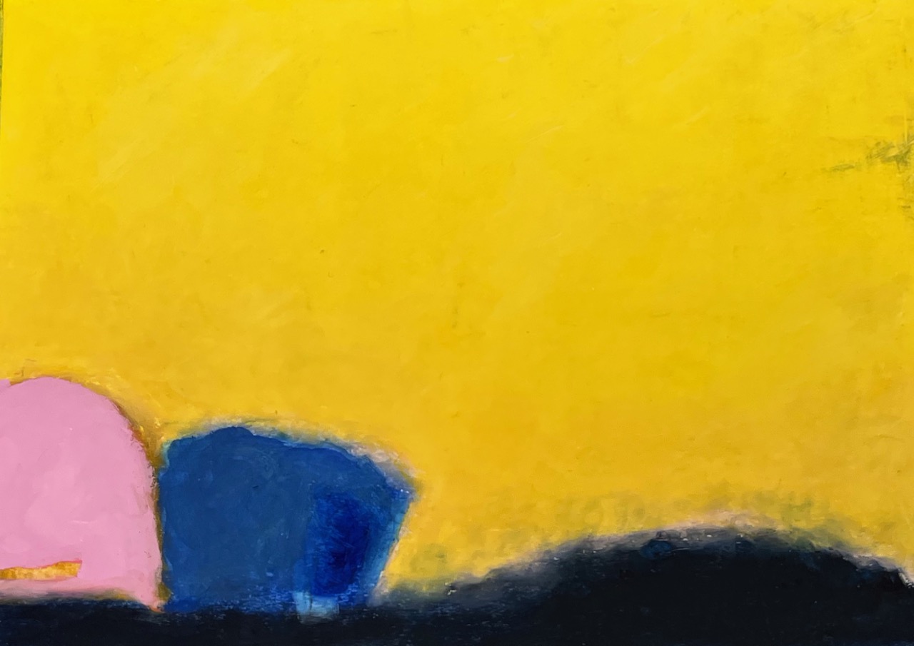
PROXIMITY
Definition: Nearness in place, time, order, occurrence or relation. All of life is in a constant state of flux. Whether it’s in the physical world or in our interior world, a flow of change and movement is present. Through the use of color, form and nearness, it’s an opportunity to explore these dynamics and the possibility of limitless experiences.
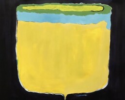
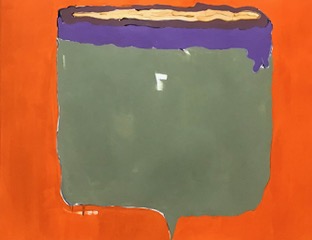
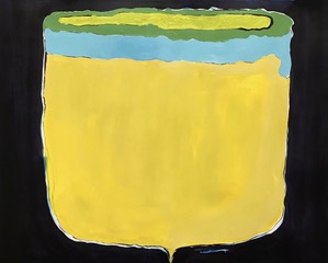
Cups
There are a series of 7 cups (six on mixed media paper and one 48×48 inch on canvas). I’ve used a mundane object that many of us use every day to help the viewer to relate to a shared experience, then turned it into something ‘other’ by color blocking and giving each of the cups a point on the bottom, changing the cups from useful vessels to unreliable objects.
But why? Because when we change our perceptions, we open our thinking and emotions to experience how the known becomes the unknown. This is the core of my work.
And you thought it was just a cup of coffee . . .
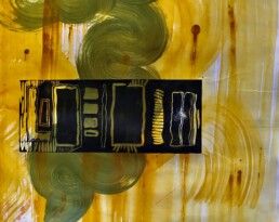
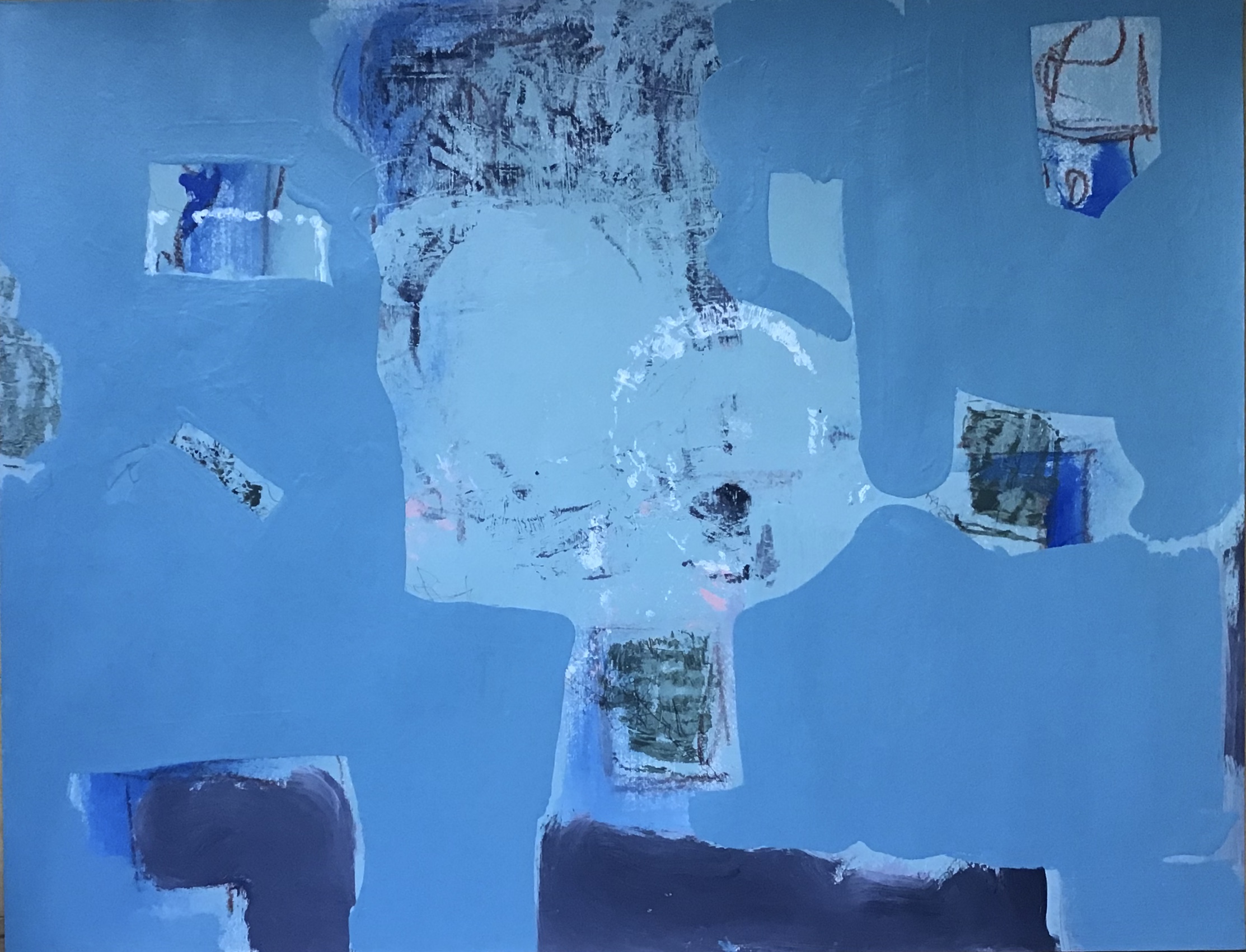
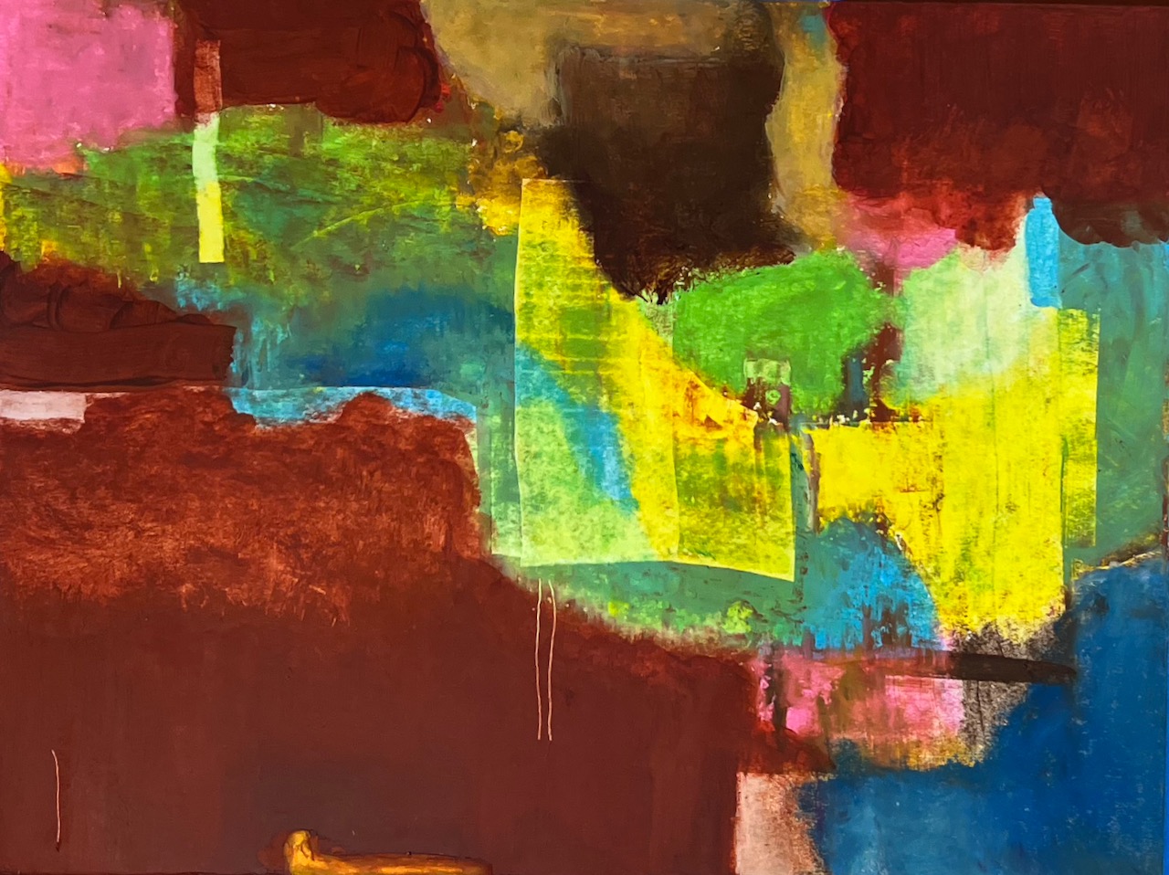
Mid-C Series
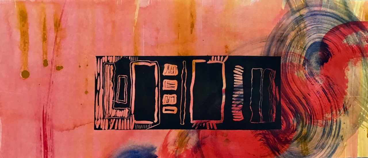
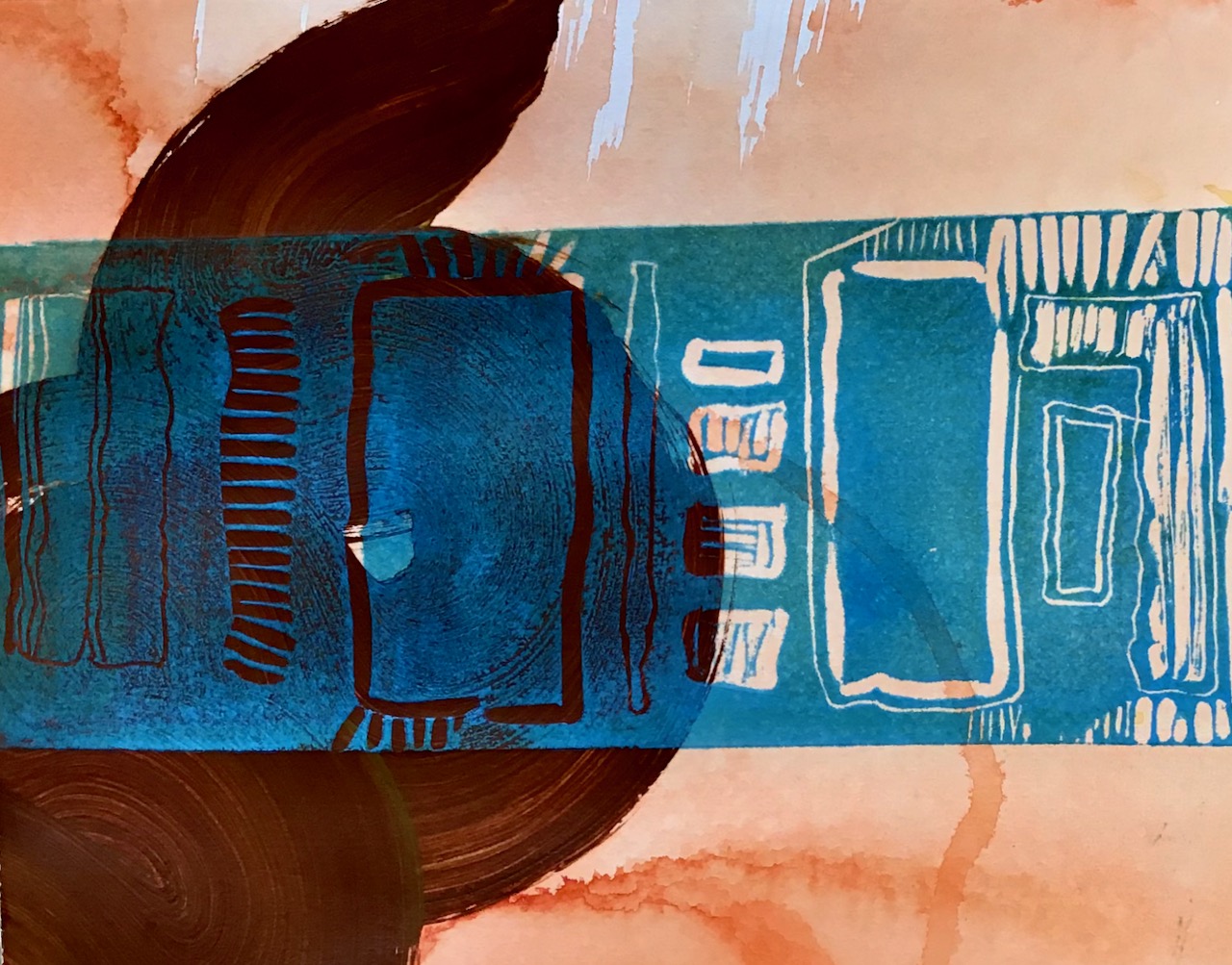
The Mid-C series is a mixed media artwork. When artists use that term, it explains that what the viewer is seeing is a layered approach to reach the completion of the piece. In this case, the imagery that is swirling with bright colors is taken from an acrylic painting that I created and then cut into pieces in a way that readied the next step of the piece. The darker image that lays “on top” of that is a linocut. To combine these two images, I used the painting as the “support” for the inked lino cut and used my etching press to print the lino cut image directly onto the painting.
On the surface, the title of the image is a nod to the American cultural interest of mid-century modern design. The colors are reminiscent of that period of history. Like many of my pieces, the multiple layers of meaning are for me the juice of creating a piece. Mid-C or middle C is also the center C on a piano’s keyboard; the first place perhaps that a child is taught to place its fingers. It interested me to see the parallels in our memories of perceived simpler times